What kind of toilet paper designer are you?
And so…I just moved back to Los Angeles from beautiful, friendly and surprisingly sunny Portland, Oregon. The Beaver state, go Ducks, Multnomah Falls, Ava Genes, Poler Outdoor Stuff, real public transportation, facial hair, beer and cocktail culture.
As I’ve long thought, and reinforced by my most recent move, moving sucks. (Sucks x infinity). I found myself in my new apartment with no stuff, waiting (hopefully not weeks) for the moving company, and for some reason I started to think about toilet paper. Specifically, I started to think about the user experience of toilet paper. Obviously it says enough about me that I actually think about this, or care. Yes, I care about the user experience of toilet paper. I’ve actually cared about this since I was very young. Some people think and care about Harrison Ford’s earring. Coincidentally they are all proud recipients of restraining orders. Am I weirder than them, doubtful to probable.
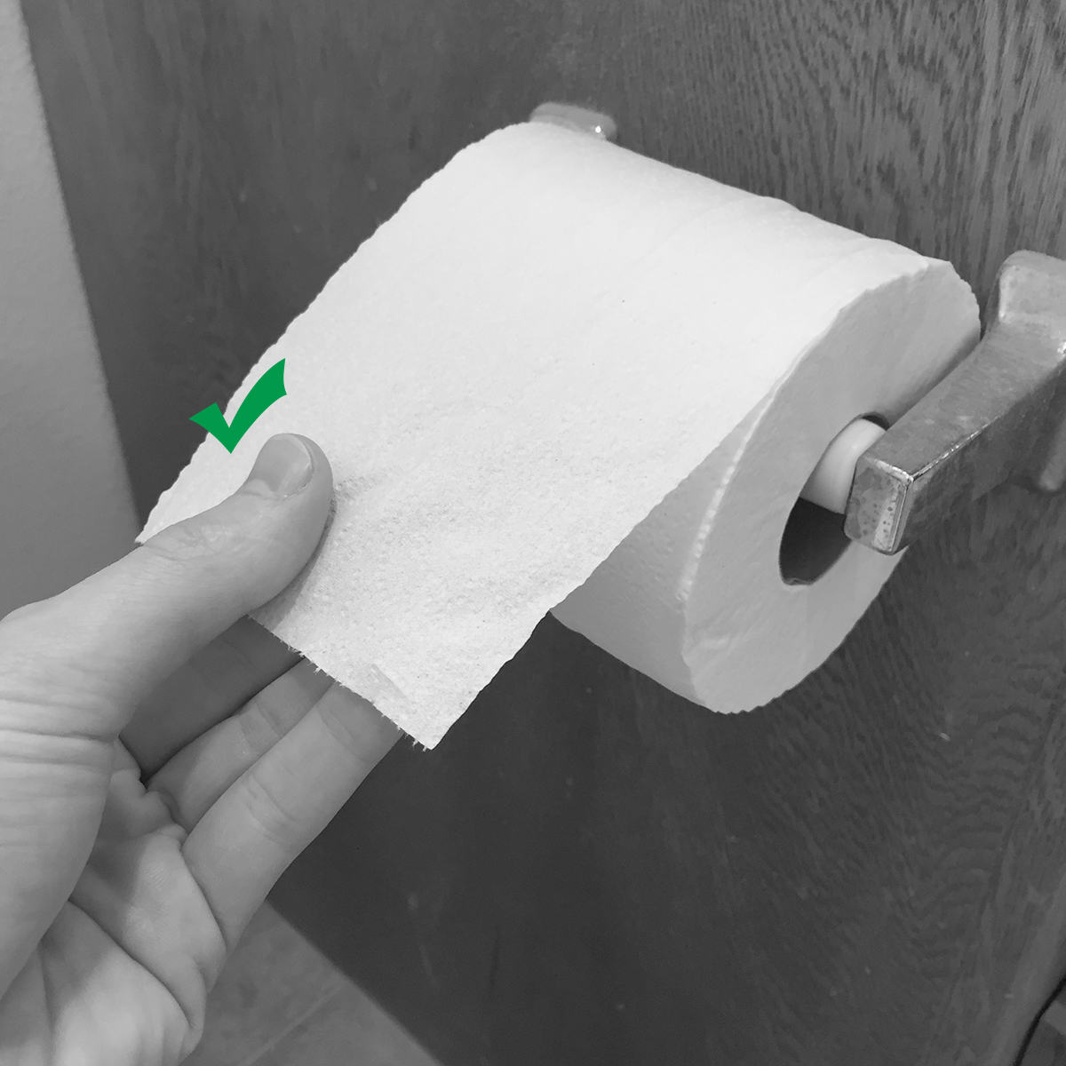
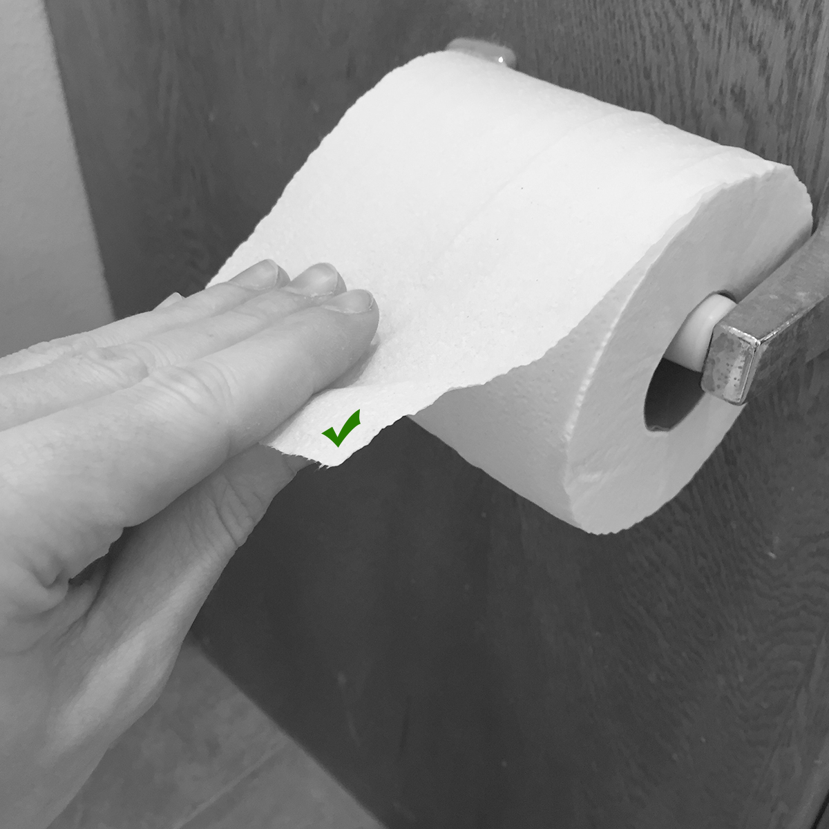
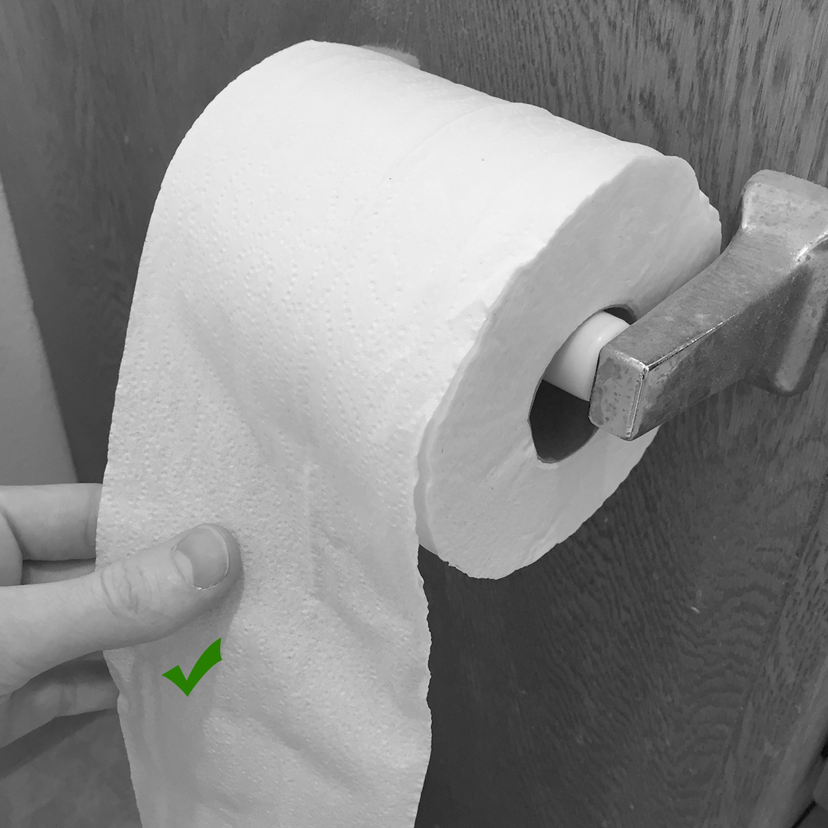
Let’s get back on track. Toilet paper position (TPP) is a quirky preference. In the grand scheme of life, it doesn’t matter. But in the business of crafting a nice user experience, details like TPP are really important. These types of decisions illustrate a greater trend of design that can trickle down to people every day with all type of products, public places, and software experiences. Alas, in order to be accepted as a reputable author, in the company of the premier laureates of our time, I did a Google search to make sure that I’m the only person on earth who has deconstructed this important issue. Sure enough, I was wrong. Anyway, let’s continue…
Toilet paper position (TPP) exists in a choice matrix of core user experience, design concerns, or DGAF (Don’t Give A **** About Anyone) syndrome.
Core User Experience
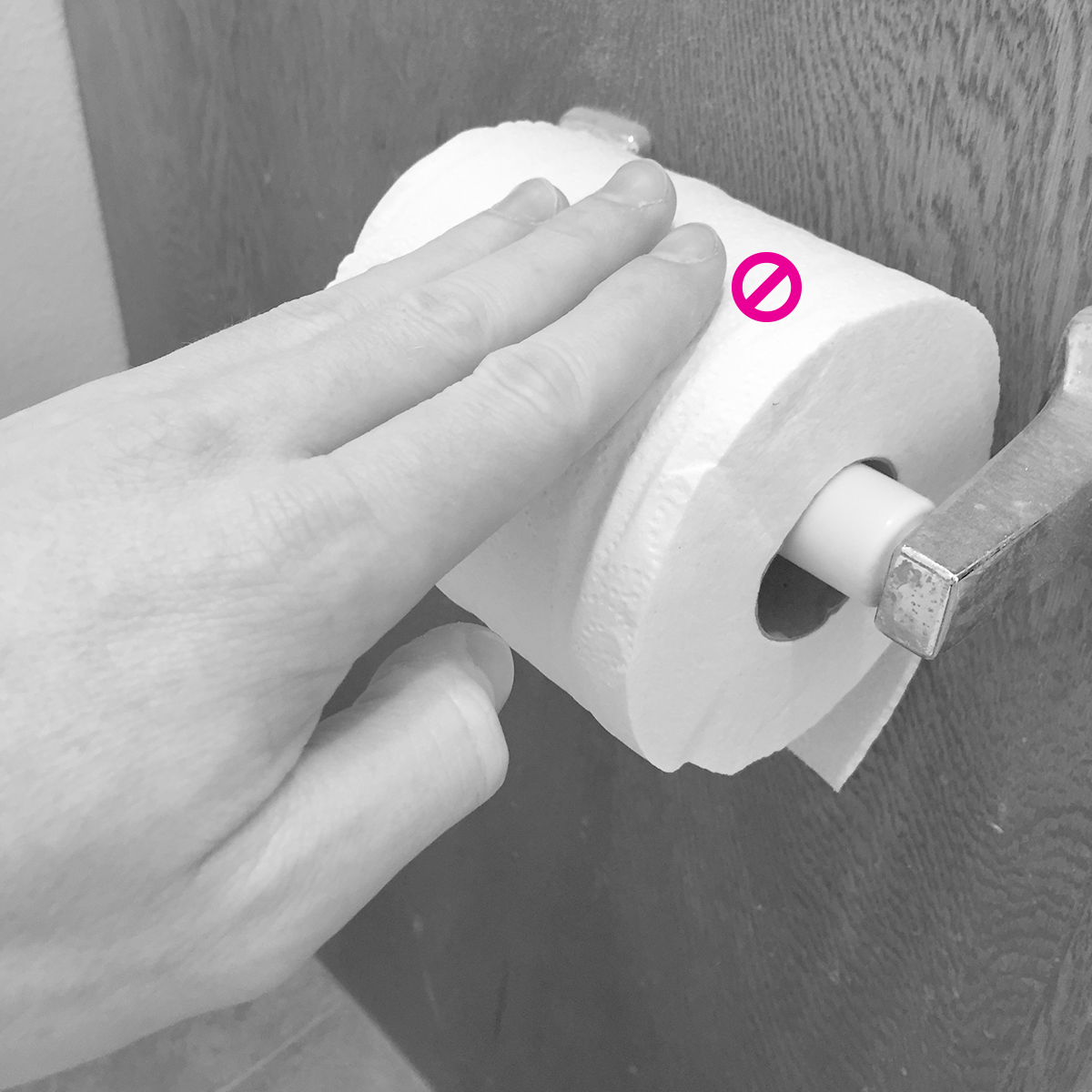
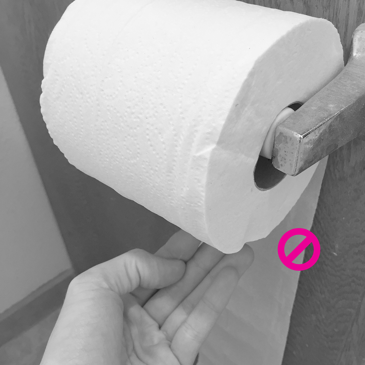
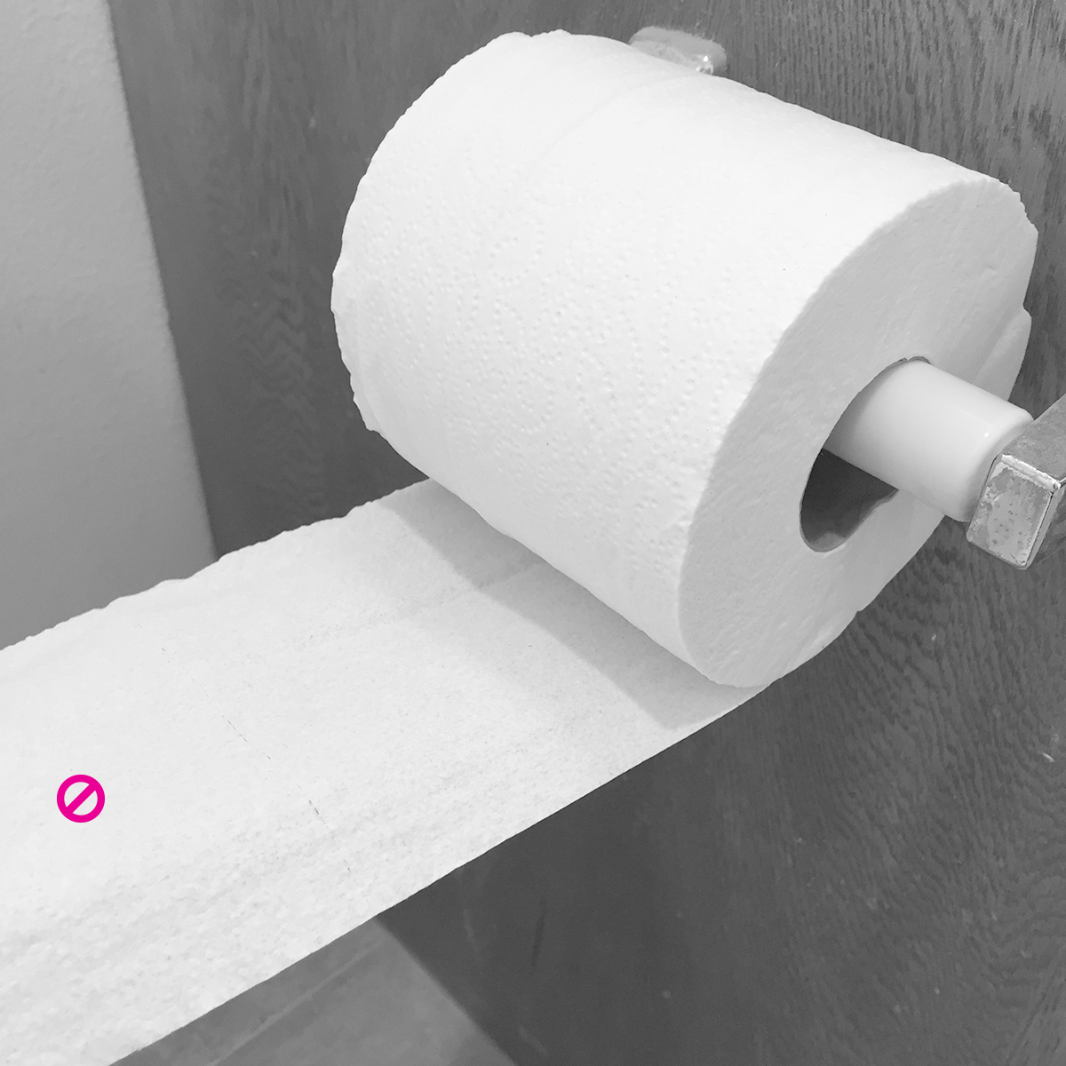
We use the restroom every day. It could be considered an emergency situation. When I reach down, my hand knows what it wants: toilet paper. I don’t want to spin the roll. I don’t want to figure out where the toilet paper is. I don’t want to run my hand all over, only to find out that some jabroni flipped the roll over and hid the sheets.


Design Concerns
Just because you “like the way it looks” doesn’t mean it’s the easiest to use. Should we turn our back on the 99% just because you “like the way it looks.” Should all the visitors to your guest bath be forced to experience the same tragic event of backwards TPP? IS IT REALLY WORTH IT!!! I say no. However, like Apple and the iPhone, if you can invent something that both looks incredible and works intuitively, I will gladly change my position.
DGAF
And now we come to DGAF (Don’t Give A **** About Anyone) syndrome. In my opinion, DGAF syndrome is a different animal than the above concerns. It is the most tragic, and at the same time most entertaining element of product or experience design. In most cases, I will have a personal, emotional disposition that leads me to a decision. Someone comes along and offers a more efficient, easier way to do something. I simply DGAF. I don’t care. I have won our two-person debate because I won’t budge. I DGAF. Anyone who uses my creation shall suffer a fate for which I am not responsible. I have won the most important battle…the battle for America…the battle for pride in TV dinners, meatloaf, Diet Coke and/or Mountain Dew, high-GMO lager beers brewed in Mexico. I beat you. Maybe I will get fired later, but I beat you.
For a good example of DGAF’ing with software, see my UX Challenge of KP.org here. If ever there was company that DGAFs, it’s Kaiser Permanente. You can tweet them here.
How does this relate to designing things?
As mentioned above, the small details are important. Sometimes we have to compromise for the greater good (business case, time constraints, priority, technical debt concerns, etc), but empathy for the end-user requires us to care. Our process as a product designer should revolve around thought for the people who are using our product every day. We must care all the time, not just care when it suits our agenda. When we birth a product into the world, we have to defend out position.
While it’s easier to identify the visual considerations for software design, it’s more difficult to categorize the step-by-step user experience considerations, the flow, the path through something. Most important are the small details, the language, the labels, how we talk about things, how we direct people to a destination, how we prompt people, how we educate fresh eyeballs, how we work with physcial habits and life assumptions. As product designers we make these decisions every single day. It’s a fun puzzle to solve, albeit a bit nebulous. I suppose that’s the art of design, or the art of interpreting the world, or the art of interpreting the physical environment. When it works, it just works. When it doesn’t, things can and will get messy.

Jeff is parked in his car, his baby is screaming, his wife is yelling at him, his car is on E, and he needs to book his ticket in the parking lot of CostCo before his lady drafts the divorce papers on a napkin. If ever there was a time to respect the consistency of link colors, this is it.
While people are out there having relaxed, serendipitous experiences with products, there are another set of people using products in an emergency situation where they don’t care why you chose to make your links light grey instead of blue. Just like the upside-down TPP, hard to find links can be a nuisance for one person and an life-changing event for another. Just as in life, businesses come and go based on product decisions. One ‘artistic’ decision can be either the nail in the coffin or lead to the next iPhone. To keep that next visitor as a customer, it could be considered a business emergency.
Please design for emergencies and usability first, then apply the window dressing.
Let’s look at some more examples that give us a similar upside-down, hidden, or searching feeling as we experience with the TPP problem.
Visual Priority
Visual composition, priority and information hierarchy will dictate how much time we spend looking at something. At times this can be good, in the case of artworks for example. We want to spend time and explore. Generally in the case of growing businesses, this is a very bad thing. The viewer has to spend time to understand things, to place things in her/his life. In our real-time world, with so many distractions, the viewer might not finish or lose attention. That’s very bad for business!
Let’s compare Ballast Point beer labels with a competitor. We are deep in the design realm. One design is very emotive and artistic, the other is bold and crisp.
R&B Brewing
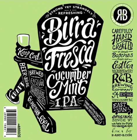
The above design is brutal. While I really enjoy the color, tone, movement and shape of the label, it’s just too hard to understand and consume the content.
- What company is this? (I’m not sure if it’s “East Van Microbrewery” or “R&B Brewing Company”, I would have to be a real local to figure it out)
- What type of beer is this? (“Birra Fresca” or “Cucumber Mint” or “Birra Fresca Cucumber Mint IPA” or “IPA”)
Ballast Point
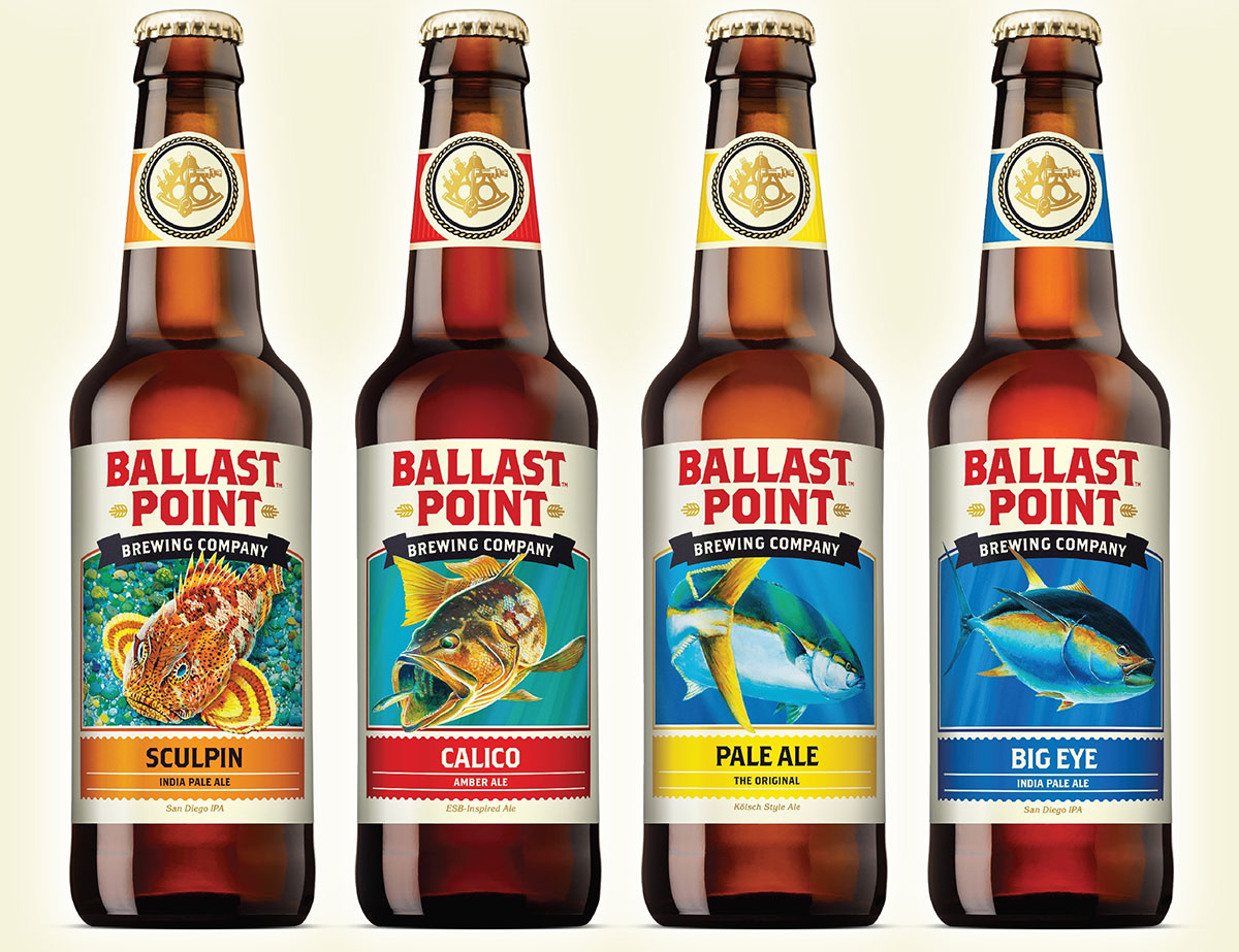
Regardless of design taste, this is an incredibly functional label.
- I know the company
- I know the sub-brand or the type of beer
- I can quickly review the entire label
- It’s bold and will be readable in low-light situations
Hidden Navigation
Hidden navigation can be good or bad. Sometimes it’s hidden in menus. For complex sites this can be a very helpful strategy for the designer. Other times navigation items are hidden in text. This is almost always bad.
For example, anyone who has started a new business has been to the USPTO website. While it has improved, it’s still very rough for a specific (and I’m sure common) use case. I want to search for a trademark to see if it’s already taken.
Naturally, I click the “Trademarks” section to figure out how to search.

I’m then taken to a page where I have to scroll down to find a special link that will take me to the search page. Ouch!

Thankfully these types of navigational atrocities are fewer and fewer as the decades go on.
Don’t DGAF it.
In closing the small door behind this strange foray into my mind, just care about people and be willing to deconstruct what you’re building. If we care about the small things, we’re likely to care about the big things, the people that use our stuff. We can apply this to so many things in this world that need some TLC. After all, we’re just designing software, but hopefully our discipline is helping us do things to help people outside of work, in whichever way we can.
Not everyone cares about the same things and that’s what makes the world such an exciting and interesting place to live. If you first share with your peers, then share with your customers or viewers, someone will come along and shift your entire perspective as a product designer and help you help them.