Intro to Framework-less Components
Component-Based-Architecture (CBA) is all the rage these days in the world of front-end development. Popular libraries and frameworks like React, Angular, Vue, and Riot, to name just a few, all use a CBA approach.
In a Component-Based-Architecture the user interface is divided into independent, modular, portable, replaceable, and reusable pieces, aka components. As an example, consider this website - the email signup to the right (if you’re viewing this on a desktop) is a component, each of the social icons in the header is a component, even the ‘TheoremOne bits’ logo is a component.
The CBA approach has many benefits. Namely, each component is:
- Reusable - for DRYer code, and consistent UIs across an application
- Portable - allowing components to be shared across separate applications
- Replaceable - easily substituted for similar components
- Extensible - to produce a new component with new functionality
- Encapsulated - so they don’t affect the rest of the application
- Independent - with no, or few, dependencies on other components
Building Custom Components, Today
If you wanted to build a custom component right now you’d most likely reach for one of the CBA frameworks mentioned above, or one of the dozens of other frameworks available today.
One of the main reasons would be ease of setup. With a solid understanding of JavaScript, and even taking into account the learning curve of adopting a new framework, you would be creating custom components within minutes. Unfortunately, your custom components are limited to use in a single framework, and your app is limited to using components built specifically for your framework.
Another option - roll your own CBA framework from scratch with plain JavaScript. Some experienced devs prefer this route, but it can add significant development time and still locks your components into a single framework.
In short, all the great attributes of components (reusable, portable, replaceable, extensible, etc) come with a very large asterisk - framework lock-in.
Introducing Web Components
Web Components (with a capital ‘W’ and capital ‘C’) is a set of four browser technologies which enable the creation of reusable, portable, and encapsulated components (called custom elements in Web Component terminology), without any dependency on a library or framework. This makes it possible to create components that are framework-less and cross-framework.
The Four Core Technologies
The four technologies, or specifications, that make up Web Components are:
- Shadow DOM - A set of JavaScript APIs for attaching an encapsulated “shadow” DOM tree to an element so they can be scripted and styled without affecting or being affected by other parts of the document
- HTML Templates - New
<template>and<slot>elements to create markup templates that are not displayed in the rendered page - HTML Imports - A method for importing
.htmlfiles into other HTML documents - Custom Elements - A set of JavaScript APIs to define custom HTML elements, built with Shadow DOM, HTML Templates, and imported with HTML Imports.
Together, these technologies allow the creation of reusable, framework-less components.
Because this article is only meant as an introduction we won’t go into details on each technology, but we will demonstrate how they’re used to create reusable framework-less UI components.
Browser Support
As of March 2018, the four core technologies aren’t fully supported in every browser. HTML Templates have wide support across most browsers. Custom Elements and Shadow DOM are supported, or partially supported, in a few browsers. And HTML Imports are supported by only Chrome and some Android browsers.
Regarding HTML Imports, Mozilla has stated it won’t ship an implementation of HTML Imports in their current form, and is waiting to see how alternative import methods like ES6 modules will evolve.
So, unless you’re developing solely for Chrome you’ll need to use a polyfill like webcomponents.js.
Building a Custom Element
To demonstrate the four Web Component technologies we’ll create a simple custom element - a 6-digit pin input commonly used for one-time password forms. It will look like this:
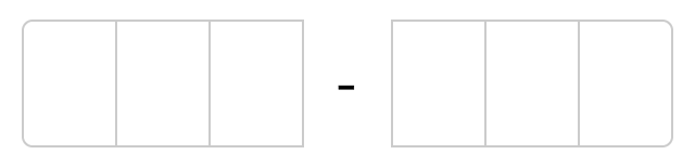
The input should:
- Allow the user to type a passcode
- Allow the user to paste a passcode
- Allow the user to navigate using left/right arrows, tab, and delete keys
- Only allow the numbers 0-9 to be entered
- Have methods for getting, setting, and clearing the passcode
Custom Element Boilerplate
Since we eventually want to import our custom element using HTML Imports, first we’ll create a new file named verification-input.html. This single file will contain the entire custom element.
In this file we’ll add a <script> tag with some boilerplate setup code:
<script>
  (function(window, document) {
    // Refers to this document, verification-input.html
    const thisDoc = document.currentScript.ownerDocument;

    class VerificationInput extends HTMLElement {

    }

    customElements.define('x-verification-input', VerificationInput);
  })(window, document);
</script>
The boilerplate consists of an Immediately Invoked Function Expression (IIFE) (which is passed the window and document objects from the host page), and a few lines to set up the custom element.
thisDoc is a reference to the custom element document (verification-input.html), not to be confused with document which is a reference to the parent doc where the custom element is imported.
The key lines are:
class VerificationInput extends HTMLElement {}which defines a new class that extends HTMLElement. And:
customElements.define('x-verification-input', VerificationInput);which registers the custom element on the CustomElementRegistry with an element name of x-verification-input. Once the custom element is imported into a page it can be implemented using an HTML tag of the same name:
<x-verification-input></x-verification-input>The x- naming convention is used frequently with custom elements because custom elements are required to have a dash in the name. A few other things to note:
- Custom elements can’t be self-closing
- The same tag name can’t be registered more than once - doing so will throw a DOMException
This 2nd point seems extremely problematic. Custom element names are defined by the developer of the custom element and imported under the same name, with no option to rename as is possible with ES6 modules. So if an app attempts to import two custom elements of the same name, DOMException.
Add an HTML Template
Now we’ll add an HTML template for the custom element using a <template> tag to create a non-rendered, cloneable snippet in the verification-input.html file. The internal code has been removed for brevity but is available in the full demo.
<template id="custom-element-template">
  <!-- HTML for the template  -->
</template>

<script>
  (function(window, document) {
    ...
  })(window, document);
</script>
And Now Some Styling
Styles for the custom element will live in a <style> tag within the <template>.
<template id="custom-element-template">
  <style>
    <!-- CSS for the component  -->
  </style>

  <!-- HTML for the component  -->
</template>
These styles are scoped to the custom element - so styles defined inside the custom element won’t affect the outer page, and styles from the outer page won’t affect the custom element.
Then Attach a Shadow DOM
<script>
  (function(window, document) {

    ...

    const template = thisDoc.querySelector("#custom-element-template").content;

    class VerificationInput extends HTMLElement {
      constructor() {
        super();
        this.attachShadow({mode: 'open'});
        this.shadowRoot.appendChild(template.cloneNode(true));
      }
    }
  })(window, document);
</script>
What we’ve done above is pull the content from the <template> into a variable, template. Then within the class constructor used the attachShadow() method to attach a shadow DOM and clone the template into the custom element.
The mode property of attachShadow() (open or closed), allows or prevents access to the shadow DOM via JavaScript in the outer page context.
At this point, the custom element will display the HTML from the template.
One interesting feature of Shadow DOM is the :host pseudo-class, which selects the root of the shadow DOM - meaning we can apply styles to the custom element root - in this case, the <x-validation-input> element itself.
One issue we discovered with the :host selector, it doesn’t work in Firefox even with a polyfill.
Now the Important Parts
The internal logic for the <x-validation-input> custom element isn’t anything fancy. Mostly some handlers for click, paste, and keydown events. Far more interesting and important are the lifecycle methods available in custom elements.
If you’ve ever built a React component you’re undoubtedly familiar with the React Component lifecycle methods - componentDidMount, componentWillReceiveProps, and componentWillUnmount to name a few. Vue Instances and Angular Components also have similar hooks.
With custom elements we have the following built-in lifecycle methods:
constructor- when an instance of the element is created or upgradedconnectedCallback- when the custom element is first connected to the document’s DOMdisconnectedCallback- when the custom element is disconnected from the document’s DOMadoptedCallback- when the custom element is moved to a new documentattributeChangedCallback- when one of the custom element’s attributes is added, removed, or changed
The last of these, attributeChangedCallback() is called only when an observed attribute is changed. And to observe an attribute we need to call observedAttributes() and return an array containing the attribute names we wish to observe. For the <x-validation-input> custom element we’re using the following:
static get observedAttributes() {
  return ["value"];
}
to observe and respond to changes to the value attribute.
Getters & Setters
Since custom elements are defined using an ES2015 class, which extends HTMLElement, the custom element inherits the full DOM API. This allows us to define getters and setters to create a public JavaScript API for the custom element.
On the <x-validation-input> we chose to add a value getter and setter, and a clear() method.
get value() {
  // return the current passcode
}

set value(passcode) {
  // set the passcode
}

clear() {
  // clear the passcode and set the focus to the first input
}
With our custom element defined, we’re now ready to use it on a page.
Import the Custom Element
To use our custom element in a document we import it using an HTML Import:
<link rel="import" href="verification-input.html">where verification-input.html contains our x-verification-input custom element definition. Once imported, the custom element can be used like any other HTML element.
<x-verification-input id="passcodeEl"></x-verification-input>With the value being an observed attribute, we can set, or update, the input using an attribute.
<x-verification-input value="123456" id="passcodeEl"></x-verification-input>Then we can create a reference to the custom element with getElementById (or querySelector):
const passcodeElement = document.getElementById("passcodeEl");to use any of the getter/setter methods we defined:
passcodeElement.value = 111111;
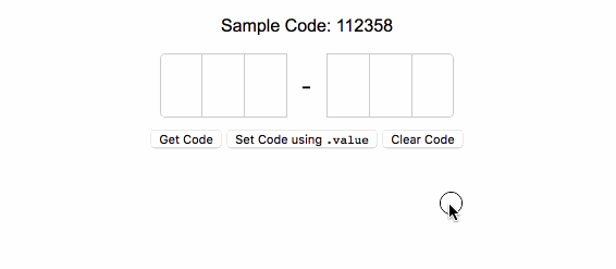
console.log(passcodeElement.value); // 111111The Full Demo
The full source of the custom element is available on Github. And a demo, with polyfills for wider support, is available on Github Pages.
Here’s a GIF of the final product in action.
Using Custom Elements in Apps
Custom elements could eventually be extremely useful, but on their own, in their current state, they’re not ready for widespread use due to the limited browser support.
That said, there are some interesting efforts to change this, making it possible to create framework-less (and cross-framework) components.
First, there is the webcomponents.js polyfill mentioned earlier for simple custom element implementations. This is a great solution for adding one or two custom elements to a page. An example of a relatively simple implementation is Github’s time-elements, a set of four custom elements for displaying times - <time-ago>, <time-until>, <local-time>, and <relative-time>.
Then there’s Google’s Polymer Library, a lightweight library to help build custom reusable HTML elements. Polymer aims to stay minimal and complement the built-in features of the web platform. Similar to React and other frameworks, the Polymer ecosystem has a wide variety of common components and state management solutions like Redux.
Relatively new to the scene is StencilJS - a compiler to generate plain JavaScript custom elements, with the advantage of Virtual DOM, JSX, and more. The compiled custom elements can be used on their own, or in other frameworks. This is a super interesting approach.
And finally, there’s SkateJS - which provides a collection of functions to produce custom elements with added lifecycle methods and render them using React, Preact or other popular frameworks, or innerHTML.
Speaking of which, if you’re already using one of the popular frameworks like React, Vue, or Angular, and want to get started with custom elements, it’s possible even without Stencil or SkateJS.
Custom elements are naturally cross-framework and there are methods to implement them into most common frameworks. In React it’s as easy as adding the custom element tag within a React component. Vue and Angular have a number of methods and packages as well.
Final Thoughts
As browsers (slowly) adopt the core Web Component technologies these polyfills will no longer be needed, paving the way for truly reusable, portable, replaceable, extensible, and framework-less custom UI elements. In the meantime, we’re excited to see how libraries like StencilJS and SkateJS evolve to allow the use of custom elements across frameworks.